

Cloud Dancer: Pantone's 2026 Color of the Year Through a Designer's Eyes
When the World Needs Color Most, Pantone Gives Us... White?
Last week, Pantone announced Cloud Dancer as its Color of the Year for 2026, marking the first time white has received this designation since the program began in 1999. And honestly? I have thoughts.
As a graphic designer with over 30 years of experience living and breathing Pantone colors, this choice hit me differently. It brought me back to every moment color shaped my creative journey, from those massive 64-crayon boxes in the 70s to the day I held my first Pantone Matching System books on press in Atlanta.
But first, let's talk about what Pantone actually chose.
What Is Cloud Dancer, Really?
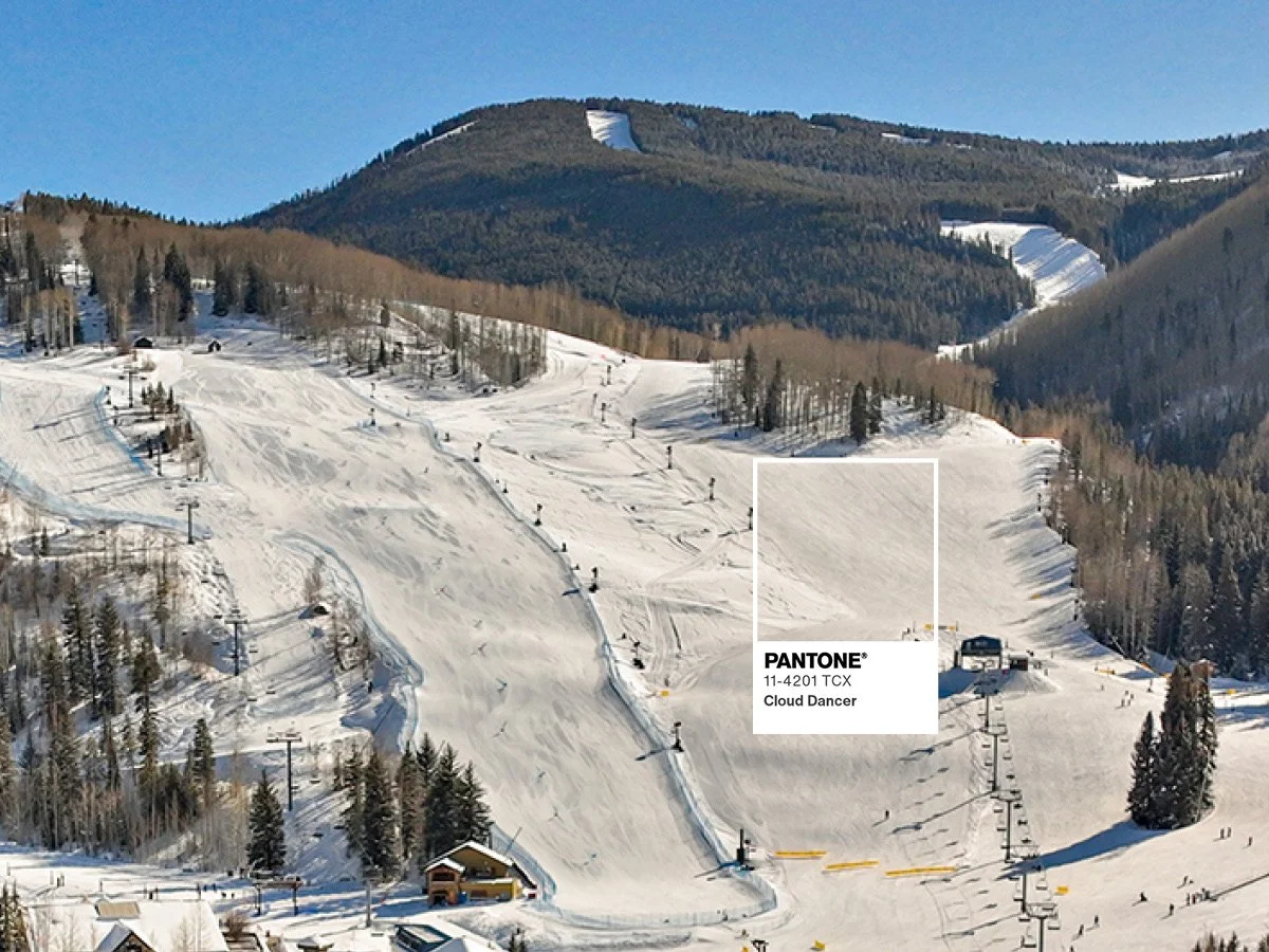
PANTONE 11-4201 Cloud Dancer is described as a "billowy, balanced white" meant to bring calm to a chaotic world. According to Leatrice Eiseman, Executive Director of the Pantone Color Institute, the shade signifies "our desire for a fresh start" and represents "a calming influence in a frenetic society".
The name itself? Absolutely beautiful. Don't we all wish we could dance on clouds?
The color features a balance of both warm and cool undertones that gives it a "natural and human quality", making it versatile for everything from interiors to fashion. It's not stark white. It's not builder-grade white. It's a winter white with just enough character to be interesting, but let's be real, selecting any white paint for your house brings its own special kind of madness.
My Journey From Crayons to Pantone Books
I've been obsessed with color since childhood. Spirograph sets in the 70s. Begging for the biggest crayon box with the most shades. Then came colored pencils, friendship bracelet threads, paint pens, and eventually a travel painter's easel. My parents encouraged every creative experiment.
Then around 1985, my dad brought home an Apple 2CE. There wasn't much color then, just black screens with white or green graphics. Games like Pitfall and Snakebite were our world, navigated with arrow keys alone.
But when I started my BFA in graphic design, everything exploded. Software like QuarkXPress and Adobe InDesign opened my eyes to the infinite possibilities of Pantone colors. My mind was blown by this universal color matching system that made precise color communication possible.
After college, I landed at Career Artist Management, then a graphic design studio, B-Man Design. From digitizing artist sketches for Cartoon Network's Johnny Bravo and Dexter's Laboratory to beta testing Adobe InDesign in 1998, to creating robust marketing campaigns for a large software corporation, color has been my constant companion and professional obsession.
Logility, a B2B software company in Atlanta, where I worked on press creating and printing annual reports. That's when I got my own set of Pantone Matching System books. Glossy. Matte. Metallics. Once you see those books in person, you realize color possibilities are more infinite than our minds can comprehend.
I remember 2000 vividly. Pantone's first Color of the Year was Cerulean Blue (the inaugural hue announced at the turn of the millennium). I was running jobs on press, and it was truly my favorite color, next to Yves Klein blue. I was hooked on this annual tradition from day one.
So... Cloud Dancer. Let's Discuss.
Here's what I appreciate: A team of 40 experts from diverse backgrounds collaborating to make the final choice each year. They don't pick these colors randomly. There's deep thought behind every selection.
And I get it. The shade reflects "a collective push toward clarity, rest, and reset" amid a hyper-accelerated world. With everything happening globally right now, maybe we do need a moment of pause. A blank canvas. Space to breathe.
But here's my designer's dilemma: couldn't we all use an injection of actual color right now? Or alternatively, with all the chaos, couldn't we use more peacefulness and calm?
I'm torn.
The positives are clear. The name is gorgeous. It's a winter white perfect for the season. It creates spaces "where function and feeling intertwine to build atmospheres of serenity and spaciousness," with texture doing the heavy lifting.
But let's be honest: even Pantone's 2006 "Sand Dollar" had more character than this choice. And last year's Mocha Mousse, a creamy pale brown that evoked a return to nature? It reminded me of pantyhose from the 80s. Not my favorite, and that's the best analogy I can give it.
The Colorado Connection
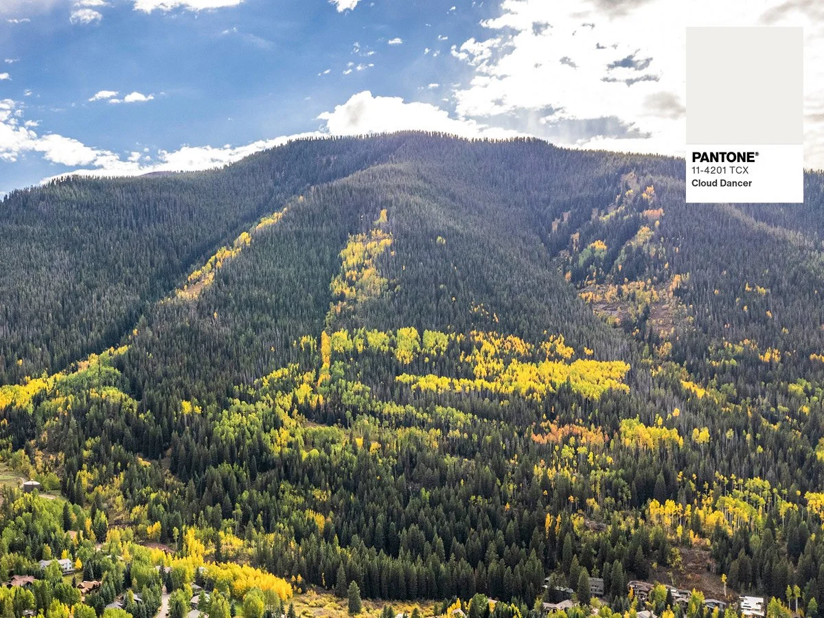
Living here in the Colorado Rocky Mountains, we see Cloud Dancer year-round. Fresh snow on the peaks where we ski, snowboard, and hike. Clouds bouncing off our famous Colorado Blue Sky that boast over 300 days of sunshine.
Maybe that should be the next Color of the Year: Colorado's Blue Sky. It’s specific, it’s particular in its shade of blue. If you have visited Colorado, you know exactly what I mean, right?
That specific, impossible-to-replicate blue that makes people move here and never leave.
What This Means for Luxury Design
For those working in ultra-luxury real estate and high-end design, Cloud Dancer actually aligns perfectly with what affluent buyers want in 2026. They're seeking serenity in an overstimulated world. Properties that offer tranquility, wellness spaces, and biophilic design are commanding premium prices. A canvas where their own collective of art can stand alone on its merits.
Cloud Dancer represents exactly what luxury buyers are craving: clarity without coldness, structure without severity. When paired with natural materials like reclaimed wood, stone, and organic textures, it creates the spa-like atmospheres that define modern luxury living. It's the perfect backdrop for custom, artisan-crafted elements and statement pieces that tell a story.
In a market where buyers are increasingly selective and patient, Cloud Dancer embodies the sophisticated restraint and timeless elegance they're seeking. It's not about trends. It's about creating environments that feel both fresh and enduring.
On the flip side, isn’t it a lifelong collection of art, antiques and new design trends layered with textures and colors that make a home and life unique? Showcasing personality versus the sterile environment that made an entry in our world over a decade ago.
The Bottom Line
Cloud Dancer represents "serenity and tranquility" that Pantone says is ever in need "in a frenetic society". Whether you see it as a brilliant choice for our times or a safe retreat from bolder statements, one thing is certain: it will influence design decisions across every industry in 2026.
Me? I'll keep appreciating the full spectrum of Pantone's books, all those glossy, matte, and metallic options that prove color possibilities truly are infinite. But I'll also watch with curiosity to see how Cloud Dancer shows up in the world next year.
Maybe we all need a moment to dance on clouds before diving back into the full color spectrum.
What do you think? Are you team Cloud Dancer, or were you hoping for Colorado Blue Sky?
About the Author: With over 30 years in graphic design, from beta testing Adobe InDesign to creating annual reports for Fortune 500 companies, I've watched every Pantone Color of the Year since Cerulean Blue in 2000. And yes, I still have my original Pantone Matching System books from my days on press in Atlanta.